🎉 Celebrating 25 Years of GameDev.net! 🎉

Not many can claim 25 years on the Internet! Join us in celebrating this milestone. Learn more about our history, and thank you for being a part of our community!

Feedback on pixel art for game

Started by
4 comments, last by nihitori 6 years, 9 months ago

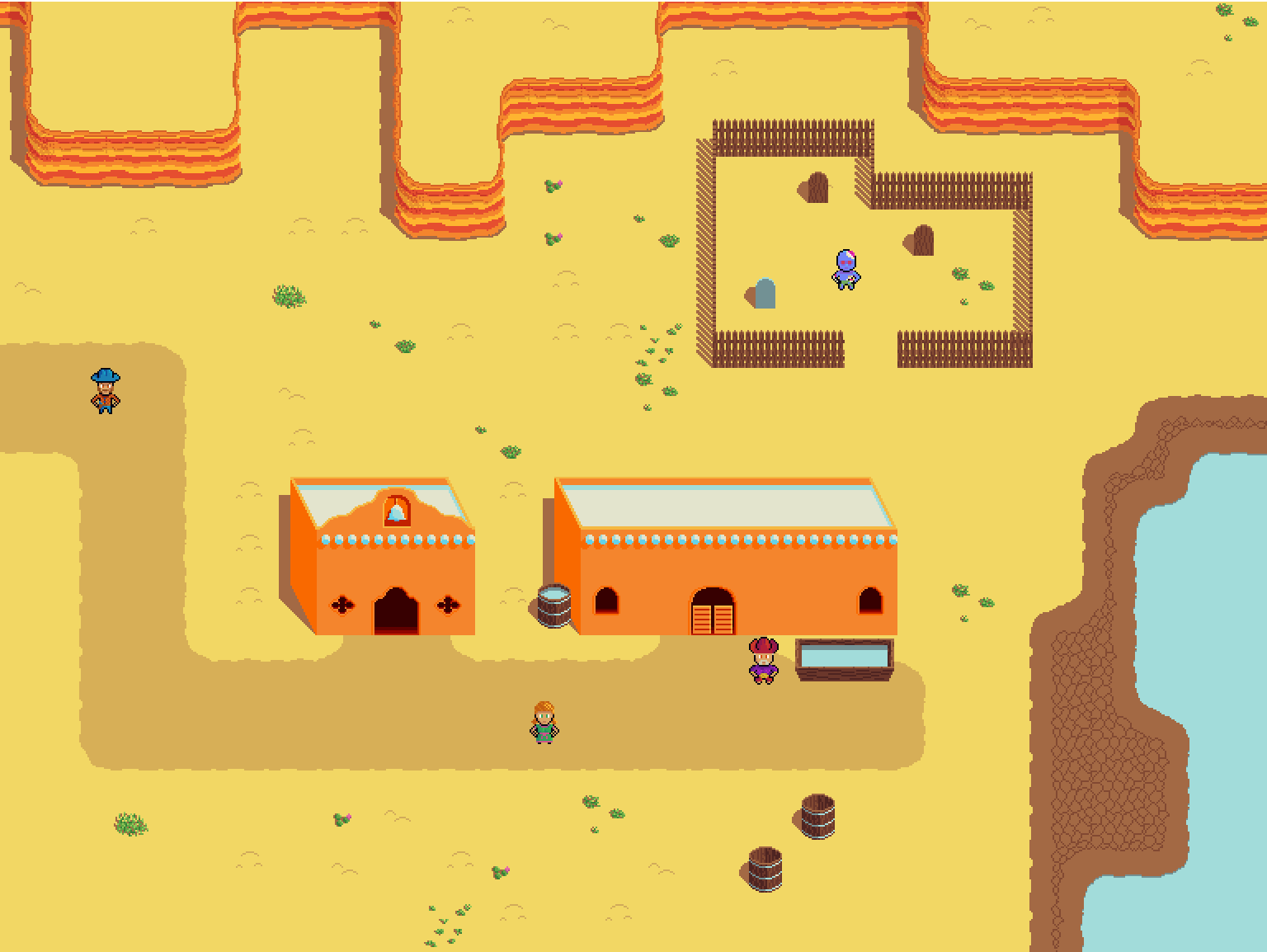
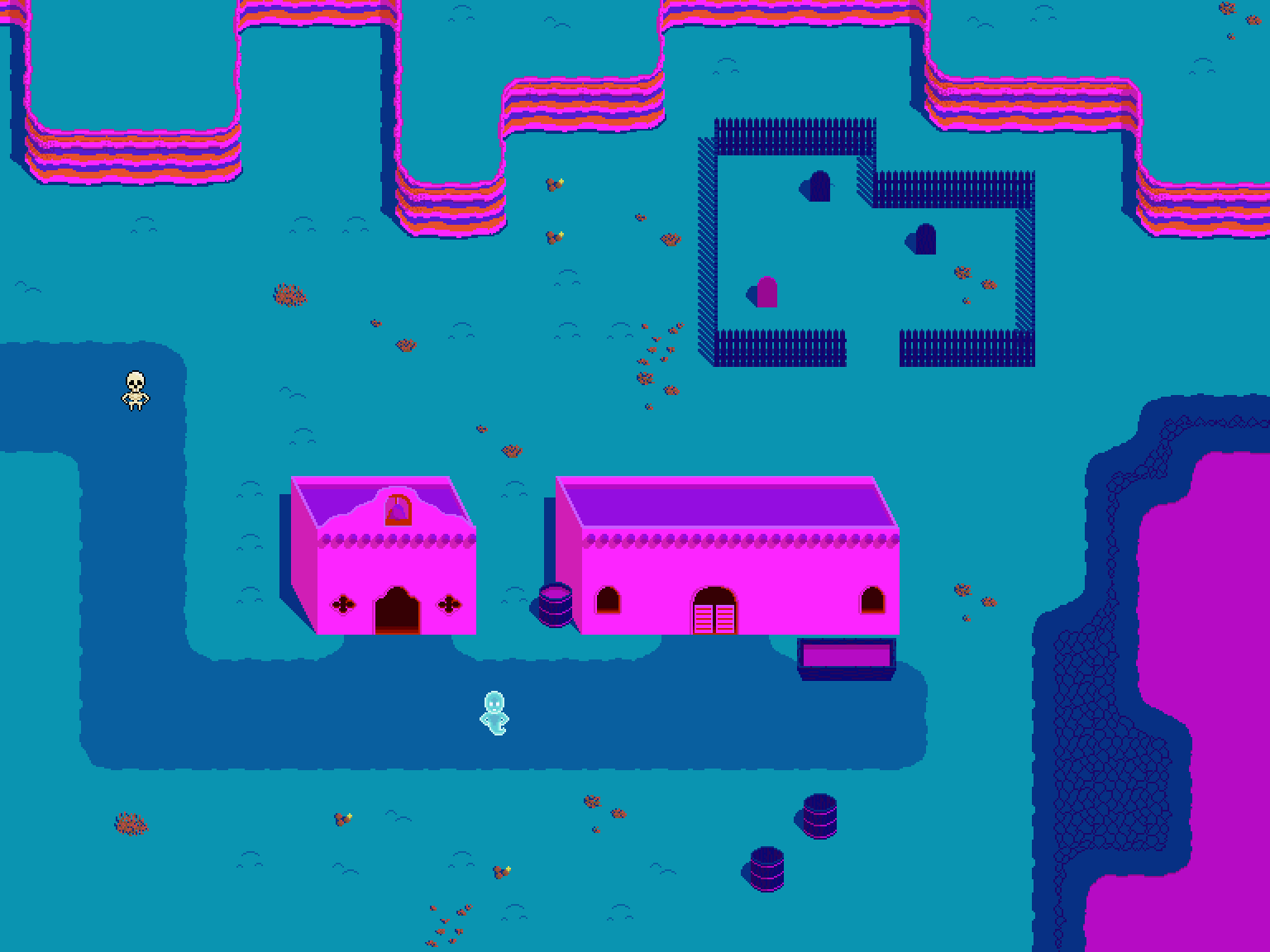
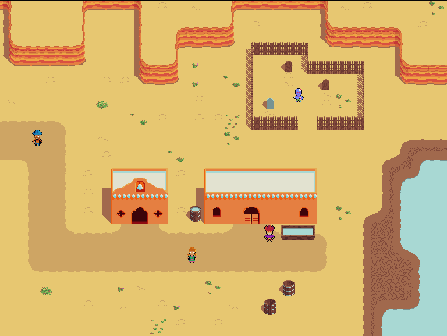
I am working on a top down 2d western with a mechanic where death isn't a game over. Instead you enter the spirit realm, pictured in the purple and blue screen shot. While in the spirit realm you need to play to come back to life.

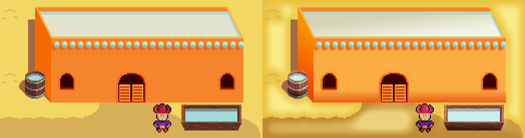
It is still pretty early but I wanted to get some feedback early to refine the style before I make too much artwork. Any feedback would be appreciated.

DessertTest.png

DessertTestSpirit.png

My current game project Platform RPG
Advertisement

Hi, nice pics so far :) !

Take my words with a grain of salt as I'm not a professional artist (only a hobbyst) + some of my changes and suggestions are based on personal preference...

I made a little "draw-over" how I would change some stuff:

  • Perspective for buildings and shadows were a bit off, it should be consistent throughout the scene (same for props, doodads, world objects and tiles).
  • The second pic (and world) looks colorful and lively on contrary to it being the land of the dead which I think is fun :) . Going for Mexican imagery? For the real world (being a western) I saturated the world colors a bit. Characters stayed, to make them pop.
  • Added a tiny change to the graves to make them look more real.

You are off to a good start, just throw in some more tile variations in there (more sand, road, building and cliff tiles maybe).

western.png

Blog | Overburdened | KREEP | Memorynth | @blindmessiah777 Magic Item Tech+30% Enhanced GameDev

It has it's own charm and I like the style. Your colors is really good.


The problem is just that I think it will be difficult to sell a game with this art style.

What I would do is scale it bigger, like the camera is zoomed in, this will give it a professional feel.

Second some simple gradients will make it look more complex than it is. You can just overlay them so that they don't change any thing.

gradient.thumb.png.b1f9980816cdaf5236292e0258f9b194.png


Those cliffs look more like slabs of bacon rather than rock or dirt.  You might want to break it up vertically.

I agree with the above post that it should be zoomed in more.  However that comes with the caveat that your gameplay might indeed be better with a wider view.  (You can't reliably shoot past the edge of the screen.)  But if it controls and plays relatively contemporary, I would hope those screen-shots are zoomed out so you can show more.

The buildings are oblique but everything else is square.  That is a blatant error you ought to fix.  Whatever style you use, keep it consistent.  Also the water trough is a horribly different angle from everything else.  You can see a lot of the face of the building and a little of the roof.  But that trough is the exact opposite.

The bell on the building on the left looks like it is a logo engraved into the wall.  It makes it look like a logo instead of a mission.  Unless that's what you're going for, carve out that spot so we can see the roof through the hole.  Probably ought to recolor the bell to a brass tone so it doesn't disappear against the color of the roof.

I personally prefer pixel art that has more "texture" to it, and I would urge you to make the sand look like sand instead of a flat color, and likewise with the walls and all the other surfaces.  But please understand that is purely a personal preference.

And... what's up with the CGA look for the spirit world?  The bright pink clashes heavily against the dark blues.  I get that the spirit world doesn't need to look natural, but that kinda hurts my eyes.

Read my webcomic: http://maytiacomic.com/
Follow my progress at: https://eightballgaming.com/

The visuals are very minimalistic, but yet seem to have a "spirit" of their own... That is not easy to achieve. Nice job!

This topic is closed to new replies.

Advertisement