🎉 Celebrating 25 Years of GameDev.net! 🎉

Not many can claim 25 years on the Internet! Join us in celebrating this milestone. Learn more about our history, and thank you for being a part of our community!

I'm trying to do the art for my next game, please help.

Started by
7 comments, last by HotButtonGames 6 years, 1 month ago

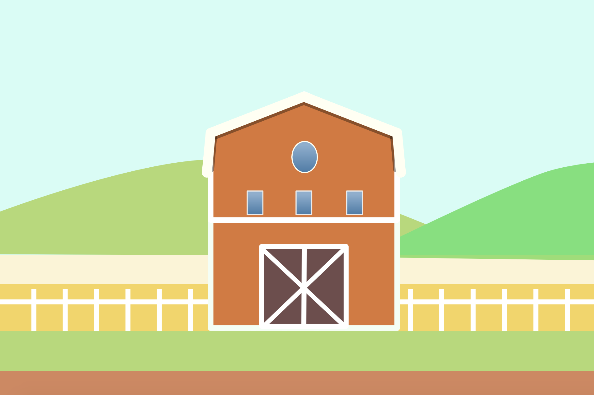
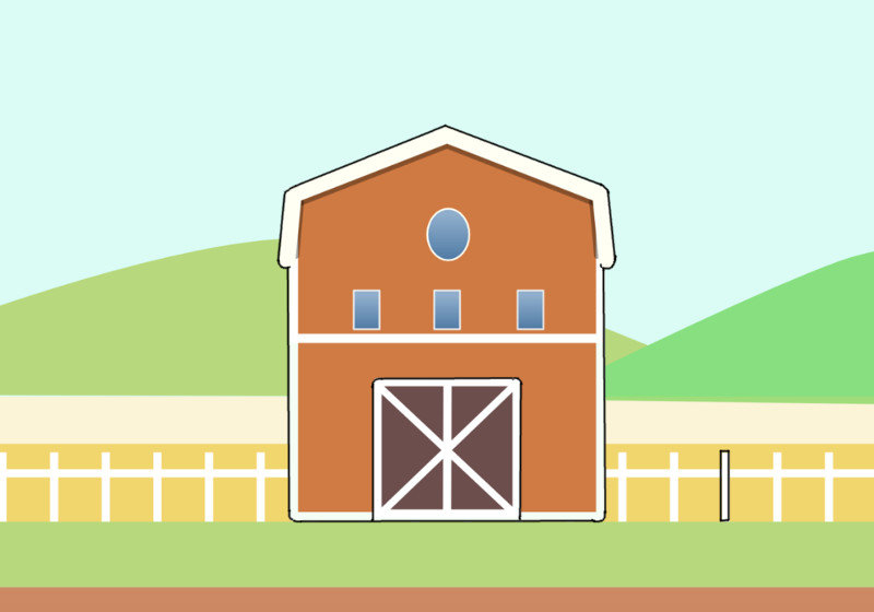
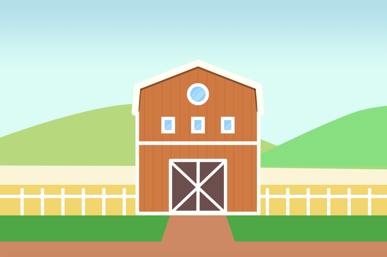
For my next game, I'm trying to create my own art. I'm not an artist and I don't know how to draw but I thought I might as well give it a try. This is supposed to be a barn or a ranch. My intention was to draw something flat with very few details, but I don't like the end result, it doesn't look "professional"( probably because I'm not ) maybe it's the colour palette or maybe the lack of details, I  just can't put my hands on it. 

What do you guys think, and how can I improve upon it?

Screen Shot 2018-05-02 at 10.41.55 AM.png

Advertisement

Just personal thoughts here.  But maybe if there was a difference between the for-ground grass' green and the background hill green.  I think the for-ground grass should maybe be darker.

I agree with Awoken. Try differentiating the layers with color and contrast to give a focus to your level (background vs foreground). 

You can also try adding texture. It will add some visual interest while keeping the simple style that you are going for. Take a look at this example. Its a simple style (maybe too stylistic), but has a clear background and foreground with subtle textures and simple layers of detail.

Best of luck with your game!

You could try adding gradients, for example, things should be darker on the bottom, and brighter on the top. I think it would be a simple way to get a bit more interesting results. Also, overall a bit darker colors.. Though I am not a professional artist, only a hobbist so I could be off. :)

Gradients is the easiest thing for a beginner to work with.

Personally I think instead of focusing on how to make it "professional" you should instead focus on making it clear. For example a black boarder around things the player can interact with, but the background this bright happy color setup. Something like this:

ClearUp.jpg.d5840c1d4a290be58e9edcf731c66428.jpg

This style allows you to guide the player and adds exploration to the game.

The player sees a new highlighted spot and wonders why it is also highlighted. Maybe clicking on that fence gives the player an item and it disappears or maybe it allows the player to build something or expand the fence.


If you aren't a professional artist and can't hire one, then the next best thing is to make the art your own style. Take this you have and do your own thing with it. That way it stands out from the crowd.

Thanks, everyone for the help. Some really useful tips.here, I appreciated. 

I don't know why I would be in a position to give you tips, but in my eyes, the cold green color (the hill on the right hand side) disturbs the overall impression. For a farm-scene, I'd stick more to warm tones. But that's just personal preference.

Other than that, it would be interesting to know what look/style you're trying to achieve. It's hard to give tips without that info. Do you want to stick to the "flat" paper-cut collage impression, or do you actually want to have light and shadow to hint at the textures of your shapes and increase their plasticity and haptic feel? I can see a very shy shadow below the gable on your first pic!  

Also, do you want to stick to strict orthographic projection or do you want to achieve the impression of a perspective? 

5 hours ago, Mogli said:

Also, do you want to stick to strict orthographic projection or do you want to achieve the impression of a perspective? 

This is a really good thing to decide on early, so you don't have to go back and change a bunch later on.

For the design, I think the gradient windows don't go with the rest of the barn. The strokes should be more consistent (thickness) across the whole barn. Some options for enhancing flat art like this would be to add some very subtle vertical lines to the barn to give it some depth, maybe some flat glares on the windows, the foreground grass darker (like mentioned above) and if you can interact with the barn, maybe adding a pathway to it like this. And when creating your image, make sure to keep your background hills on separate layers so you can create some simple depth with parallax scrolling.

Hope this helps. You're off to a good start!


Barn.png

Specializing in 2D Game Design

This topic is closed to new replies.

Advertisement