🎉 Celebrating 25 Years of GameDev.net! 🎉

Not many can claim 25 years on the Internet! Join us in celebrating this milestone. Learn more about our history, and thank you for being a part of our community!

Looking for feedback on my space scene

Started by
9 comments, last by GD_Entertainment 5 years, 10 months ago

Hello everyone,

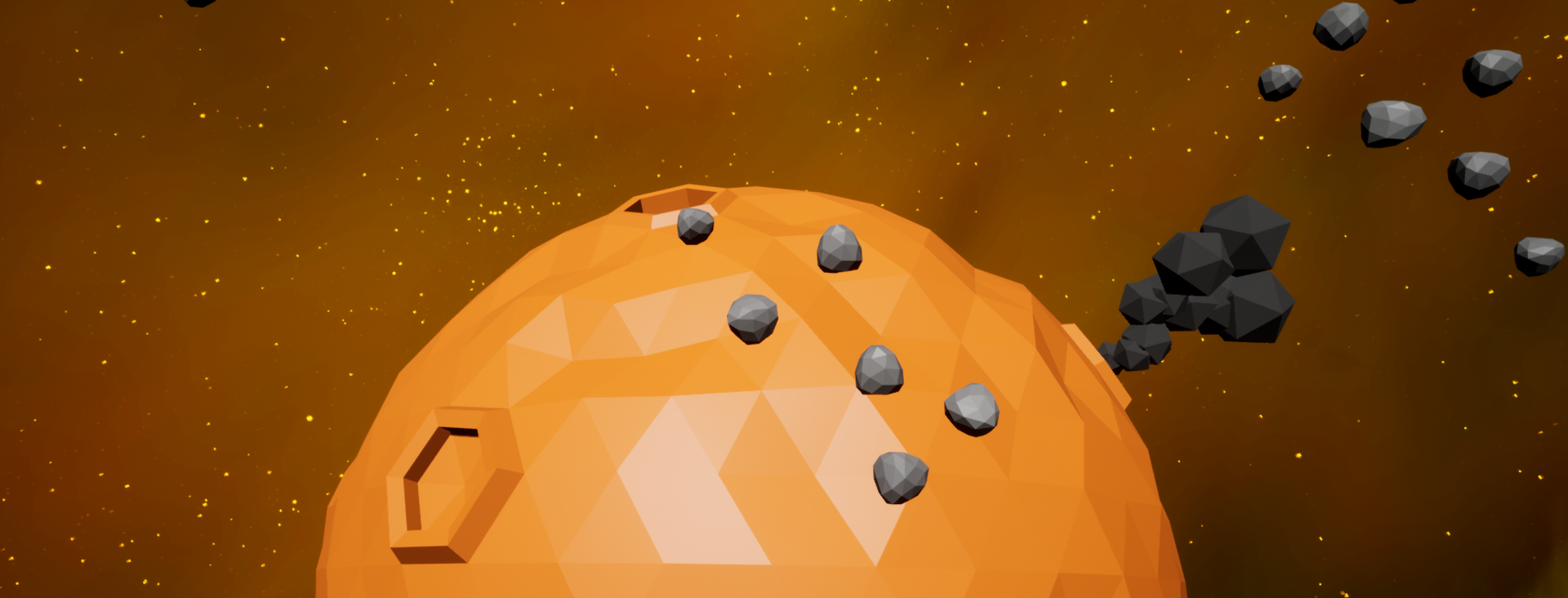
For the past few months I have been working on a tower defense game set in space. The attached screenshot shows the main scene where the action will take place. It features a starscape and a planet in the background, as well as smoke coming from a crater where a meteor hit. Furthermore there are asteroids in the scene which the player will use for resource gathering. I continuously catch myself changing the visual direction and I have come to the conclusion that I simply can't tell what looks good anymore. I am going for a as-low-as-possible-poly art style since I am a programmer by trade and only get around to dabbling in other fields in a few precious hours in the evenings. I would love to hear what others think of the scene in terms of models, colors, lighting, and whatever crosses your mind.

Thanks you very much!

Naamloos.png

Advertisement

The smoke looks like the asteroids, you could make it transparent, or do something cool like shrinking the triangles by particle age (so edges become see-through).

The background is bright. Because of this the constant ambient term is too low. With such an orange background The asteroids should not become entirely black, but should have a dark grey / orange ambient.

I wold use small quads for the stars, so it has a pixel look that suits the low poly look of the geometry... eventually.

... some spaceships with light blue thrusters and energy trails?


I do quite like the low-poly style.

I'd make sure that it still looks diverse enough. For example the crater on the far left looks like a simple extrusion and inset, I'd give it some more uniqueness in shape.
What I don't really like are the super basic shaders on the planet and the asteroids. The smoke, however, is nice.
You could also try and experiment with some vertex coloring to create mild gradients. 

I'd experiment a bit with different spec colors and weights and try to get away from that plasticy look.
One question would also be what these models look like in relation to the actual tower defense assets themselves. 

On colors: You have a lot of orange. That in itself is a nice color, but you could try putting some complementary/cold-warm contrasts in there, maybe have the sun be blue, or the tower defense assets more in the colder color areas. Or maybe both.

I think the stars are good in a round shape, just to touch on JoeJ's point. It creates a contrast to the low-poly look, which is nice, in my opinion. If you go for square stars you'll kind of end up with a minecraft sky.

Edit: Oh and one thing I would consider is making the asteroids more lowpoly, right now they look a bit out of place, especially compared to the blocky look of similarly sized objects like the smoke.
A neat technique for low-poly asteroids/rocks is to quickly sculpt a nice silhouette, and then decimate the poly count to something very low, it's quick, looks natural and gives you nice variation. 
 

Thank you both for the great feedback, @JoeJ and @Liacart! It's good to see some of my doubts confirmed and I very much appreciate the suggestions to make it better. I'm going to give these a go over the coming few days. I will also prepare a scene with some of the towers and ships in place I have finished. Thanks again!

As of now it’s very low poly and kinda just blah. Not very interesting and needs to be textured.

I think that's a bit unfair. Low-poly can be a very nice aesthetic if approached the right way. Textures aren't always a must to achieve a nice and atmospheric visual language. 
 

Lol so your criticizing my criticism on a crirtize forum ?... right

Another vote for sticking with your current general approach. (If I saw a game with that aesthetic I'd certainly be interested in trying it.)

On 8/18/2018 at 1:42 AM, Brandon Sharp said:

Lol so your criticizing my criticism on a crirtize forum ?... right

I'm merely supporting a different opinion. Which, I hope, is appropriate on a discussion board such as this one. 
The reason I said it's a bit unfair, is because both the low-poly and the non-textured approach can very much be an appealing style, as many games have proven before. 

Simply, love it! Simplicity makes it stand out.

This topic is closed to new replies.

Advertisement