Hi all,
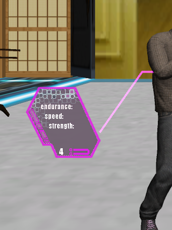
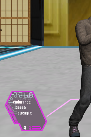
I would like feedback and ideas on how to improve the UX for an indie game I am working on, in Unity. First of all, I am not an artist so pardon the quality of my art assets. What I have in the UX below is a 3D character and a piece of interface that displays some stats about his limbs, such as arms and legs. The limb UX is connected to the limb it represents with a line (drawn with the Line Renderer component in Unity). The problem I am having, and what I want feedback and improvement ideas on, is that the line in question is difficult to distinguish from the background. I've tried different colors, but none seem to work well. Also, because i didn't want to make the line thick (it's current width is 0.02), i couldn't really have any significant outlining. I am open to making the line thicker though, if that would look better and make it stand out more, and also if it works well with the limb UX.
The bottom line is that I want the line connecting the limb UX to the limb to stand out and be easy for the player to distinguish from the background. Also, I would like feedback on the limb UX itself, that's the shape outlined in purple. I am thinking it should probably be bigger and I am not sure that purple works well with the rest of my level.
The first two images below are screenshots of the UX i want feedback on. The second two are ideas i've been bouncing around about to how to improve the UX in question, though I am not sure it would look any better.
So what are some ways I can make my UX interface stand out more and look better?