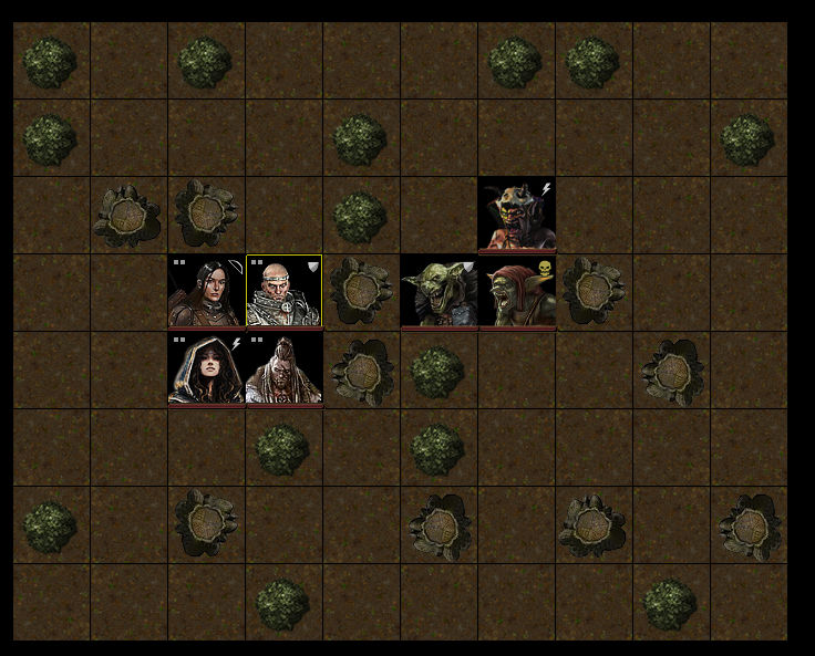
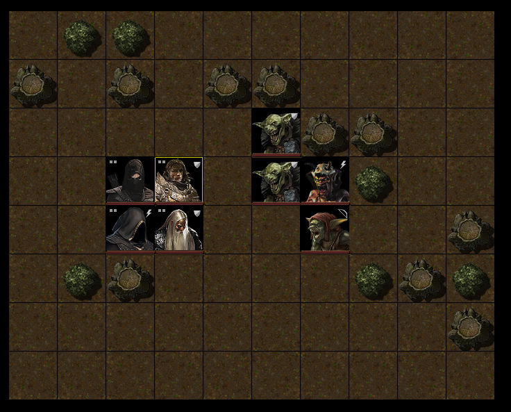
Some thoughts:
1. The character art is gorgeous. Unfortunately this makes the rest of it look worse by comparison.
2. The square character frames are dull. Could you give them a border and a bit of separation from each other? And maybe vary the backgrounds a little? They're all very black square.
3. The ground is very uniform and boring, some variation would make it look a lot nicer. For example, adding a worn footpath, fallen branches and leaves, or some clumps of forest flowers would go a long way to livening the scene up. For bonus points, make sure the divisions in the ground don't match the grid shape.
4. The shadows are inconsistent. You're just rotating the same tree trunk for variation, but doing so makes your lighting inconsistent, and this looks bad.
5. Everything is pretty central to the squares, rather than pushing the edges, this emphasises the unnatural blockiness of it all.
Pushing things a bit further, real trees have canopy, could you show the canopy either with a transparency, or a transparency as characters move under it? Or, alternatively, show the pattern of shadow and light falling from the canopies to give more variety and life to the ground?