Sprites were inspited by LISA
Not many can claim 25 years on the Internet! Join us in celebrating this milestone. Learn more about our history, and thank you for being a part of our community!
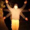
Color composition
Your hue composition is good by following the 180 degree rule.
The luma histogram could be spread more evenly over dark and bright, because local contrast is too intense on the small lines.
The blue mask is too dark to see the mouth without zooming in on my computer's gamma settings (50% luminosity at 80% of white).
Some highlights with brighter blue can show the shape without breaking the cartoon style, just be aware of using too many tones.
Edges
Give more focus to the main edges and make sure that the total silhouette still looks interesting if the whole character is faded to black.
Maybe he could have some long ears, a cape or shoulder protection sticking out.
Frequency domain
A bit heavy on the highest frequency, not sure if the style can be easily animated without confusing the player.
Perspective
The head and upper torso is facing the player's left side, but the legs appear to be facing forward. Adding extruded feet would create a feeling of rotation.
Make sure to look at your character in a context while designing, because the characters that look good in a 2D game often look too simple on it's own. It's all about making scale and composition go together with the game as a whole.