Not many can claim 25 years on the Internet! Join us in celebrating this milestone. Learn more about our history, and thank you for being a part of our community!
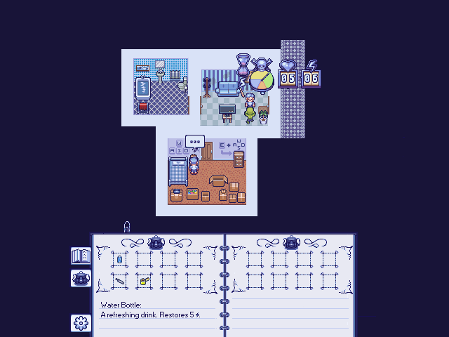
I'd like to know which one of those inventory system looks the best to you. Simply typing a single letter would do. If you feel extra helpful, you can comment about the inventory systems. Each system is associated with a letter as mentioned in the image description.
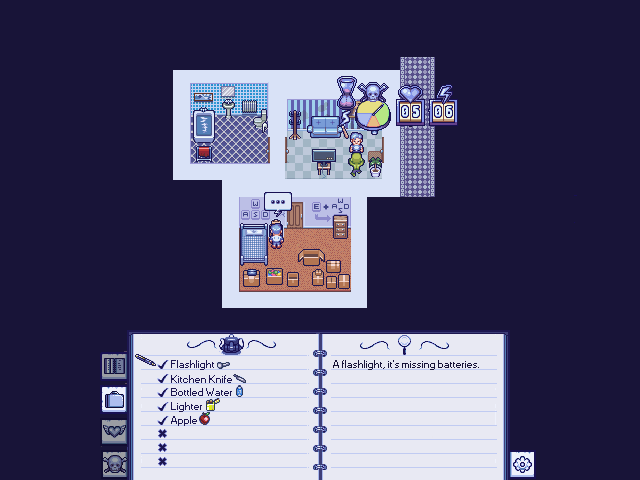
I like A the best for its clarity and ease of understanding, but I would put the item icons on the left side of the text to make them all horizontally aligned.
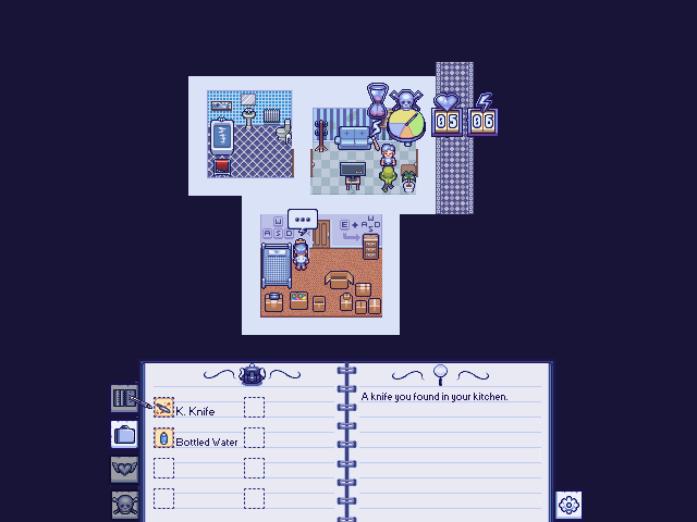
B is similar to A, but with 2 columns of items and more space. I think the only advantage of B over A is that you could potentially put more items in the same space. My preference if you need more item slots is to make A two columns (shrink the pointer icon to make room), rather than use layout B which seems to have too much empty space.
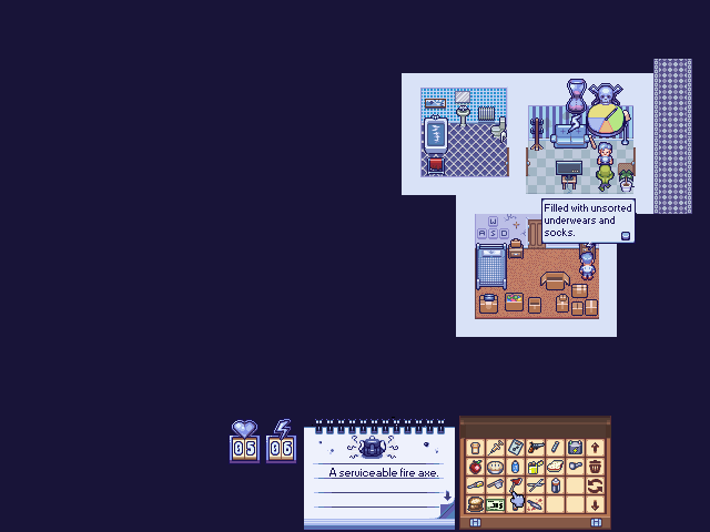
C and D are similar in layout, but C is better than D because it looks more like a real notebook, and has text for the items. D reminds me of Morrowind's interface, which is sometimes hard to tell apart the items without names visible. If you do use D, the item grid should be to the left of the description because we read left-to-right in most places, and you might need to add “tool tip” popups with item info (similar to Morrowind).
I'd like to second @aressera 's rankings on this. I think A would honestly work really clear in sort of a mystery/investigative/resource management theme. Since it sort of feels like an organic way to track your inventory. C functions like a real notebook and reminds me of some of the old-timey RPGs and hits me with a little nostalgia.
B is a little to noisy because you're splitting a contextual menu like ¼ ¼ then ½ for a description, it's just not that clear. And I think D is a little too minimal to feel like you're really looking at anything informative
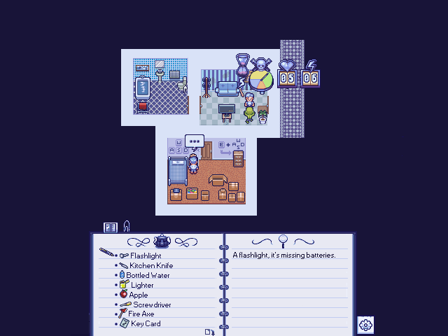
Thanks for the feedback guys. So based on your comments. I've made some modifications over A as it seems to be the most popular:
I'd say my only concern is code wise. Having boxes for icons facilitates coding I would think because icons always occupy the same spot. There's no need for the text to ‘wrap’ next to the icons. Right now, text would need to be automatically formatted to be a certain distance from the icons. I mean it's certainly doable but will be more expensive for me when it gets to coding.
I've changed the checkmarks for little dots as it made more sense to me. Changed the flourish up top as well as added an icon to indicate more items are available below if you scroll.
Having boxes for icons facilitates coding I would think because icons always occupy the same spot. There's no need for the text to ‘wrap’ next to the icons.
Can't you make all icons square images of same size? You can make the image canvas be larger than the image itself (with transparent pixels) so a mostly horizontal item would occupy the same space as a mostly vertical item.
@Zizka Personally I'd have the icons on the left side instead of spanning all the way across both pages, less travel distance if using a controller. Then I'd have the details update on the right as you're currently doing on the left side. Gives you more space to get creative with item names and descriptions as well. Also, the boxes around each icon feel slightly “busy” to me, they are nice, but are somewhat distracting from the icons themselves.