On 11/15/2017 at 11:08 AM, mmk0102 said:
Which of these two looks better now?
The second one again.
if you want to change the look of the spheres I have a little quick trick for you, click on the spoiler if you want to see it:
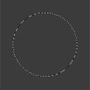
1.) So you start by making a circle using the circle tool of your 2D software.
By having a zone selected you can brush as wild as you want on the inside and will still always get a circle.

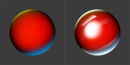
2.)Follow that up by shading the basic sphere, just fill it with black and use a white brush in the center. If it isn't smooth, you can blur it.
How it's shaded will impact the final material. For a glossy look use a strict contrast between black and white.

3.) Add a specular point on a new layer. The specular is just a large white spot.
Spheres are smooth and round, so there speculars should be near the center. The exact point will depend on where you decide the light is coming from.

4.)On a new layer add Fresnel to the sphere. You do this with a large white brush, painting half way out of your zone so that only a bit of white enters the circle. Erase the center part so that it is only on the edges.
Fresnel's law explains how we see more reflective light when looking from a angle.

5.) Last you add reflections. This is very easy, just do a few white brush strokes with a white brush. Then use the eraser with a very sharp brush and erase parts of your strokes.
Erasing with a sharp brush is how we get sharp edges in shading.
You are done. A easy sphere in 5 very easy steps. This took just over 8 minutes to make. Your first time will be a bit slower.

To color a sphere you just color the first layer. Playing with the layers will help you achieve other looks. Having a photo reference also helps.
If you want to be fancy you can add color theory, but the exact amount will change depending on what you change in the other layers.
Because this is so fast to do, it is a easy way to practice shading and other concepts. Using only these layers and changing things around will help you understand materials.
For tutorials and other art related things, checkout Pinterest.
That is if you are interested in learning about 2D art. If you are more of a developer then you are free to leave this to the artists.
12 hours ago, zarloo said:
How about helping this developer improve upon their understanding of art fundamentals
Good question why did you start with color theory and not a fundamental of art?
12 hours ago, zarloo said:
Please don't start with this! Unless you plan on diving into the deep end of art and learning the frustrating way.
Learning monochromic first, before moving to color theory is a better idea. Before that shape and form should be well known and before that silhouettes. Basics on lights and reflections also helps with color theory.
Reasons color theory doesn't always work:
1.)A large amount of people are color blind.
2.)Men and woman don't see the same colors.
3.)No two people see the same colors, some people don't even see the same colors with both there eyes.
4.)Devices don't show the same colors. Players don't use the same settings.
5.)Color theory works best with minimalist art styles. With more complex art styles it creates noisy scenes because of the complexity.
6.)Color theory works best with limited color pallets.
7.)Unless the artist knows monochromic colors, color volume principles and saturation principles your going to do more harm than good. It makes for fun learning though.
8.)Most color combinations are similar, making the game look washed out.
I am not saying color theory is bad. I am saying that it's a bad place to start. Please don't go around the web spreading color theory like it is some kind of magic way of making things look good.
On the other hand if people wish to research color theory here is a good tool: https://color.adobe.com/create/color-wheel
12 hours ago, zarloo said:
You are just doing useless A/B testing.
Learning this way will be harder but worth more in the end.
@zarloo you have the critical mindset needed for art. However not everyone wants to be a artist, forcing art principles on someone will only frustrate them.
Hope to see more of you around, the forum could do with more artists.