🎉 Celebrating 25 Years of GameDev.net! 🎉

Not many can claim 25 years on the Internet! Join us in celebrating this milestone. Learn more about our history, and thank you for being a part of our community!

Fixing color palette that is too dark.

Started by
3 comments, last by Prinz Eugn 4 years, 9 months ago

Since I'm not a good 2D artist (learning sloowly with low motivation but that's a different topic) here's what the current art process is:

  1. Model a thing in Blender.
  2. Render it in a low resolution.
  3. Using ImageMagick apply a color palette.

The palette is I think the SNES palette that I took from Wikipedia and cropped a little bit.
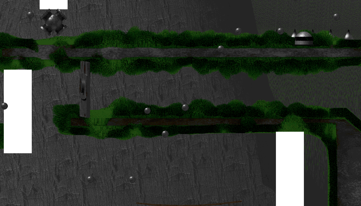
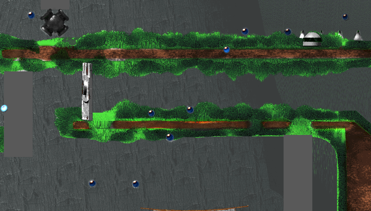
There's a problem though, below is a screenshot of the game. Excuse the size :P.

It's extremely dark, I can't say if it can be passed off as just a "style" but it's even a bit hard on my eyes. And see the background, the black with green spots? That's supposed to be tall grass, but the palette reduces detail until it just looks like overly peppered lettuce.

The white rectangles will be ladder sprites, it's unfinished at the moment.

image.png

Advertisement

If you use rendered 3D models, why the palette constraint? That hardly ever looks good without much extra work, IMO.

Otherwise you could apply a cell shader in Blender to reduce the number of colors and get a more cartoony look. But then you'll still have a very limited palette and probably have to do a lot of color replacing.

I'm doing it like it was done for Donkey Kong: Country, which is why there's a palette.

On 8/26/2019 at 3:38 AM, midn said:

I'm doing it like it was done for Donkey Kong: Country, which is why there's a palette.

I wouldn't give yourself such an artificial limitation, especially if it's already causing you trouble. You can bet they spent a lot of time cleaning up and modifying the 3D rendered sprites in old games like that to work within those constraints.

A bigger problem is that you have very little contrast in your scene, which the pallet isn't helping with. It's really hard to tell what's supposed to be in front/behind or what's intractable (or not), like those little balls I assume are objects but blend in with the background text. Here is a hacky example in photoshop of improved contrast:

GamedevPlatformerBrightness.png

-Mark the Artist

Digital Art and Technical Design
Developer Journal

This topic is closed to new replies.

Advertisement